Great stories need to connect with people. They need to make people envision and appreciate what's going on.
We covered 3 potential components that you should think about incorporating into your science story pitch: Anecdotes, Analogies, and Imagery.
Anecdotes- A short story related to the topic that is amusing and/or interesting. Did you find yourself in a cave surrounded by angry bats? Or have to
Analogies/ Similes/ Metaphors- Generally, these are comparisons between two (or more) things for the purpose of explanation, clarification or illustration. In science, this is really useful for giving people an idea of the scale of your work, especially if what you study is really big or small.
For other senses, see discussion below about imagery. You'll be using analogies/similes/metaphors for describing how things look/ feel/ smell and taste.
Imagery- (Both real and verbal)- People reading/ looking at/ listening to your story should be able to see or envision what your work/ study species/ environment looks like, not to mention what it smells like, feels like and tastes like. Describing the ways that your science engages with the senses helps people form a real connection. Get your adjectives out people.
Some resources on how to choose actual visuals:
Pictures of numbers- A site by a colleague of mine from NZ which isn't really updated much anymore, but has some great examples of how to visualize data.
I like this blog post from the American Geophysical Union on 'Crafting your own visuals for science communication'
Our second activity gave everyone a chance to brainstorm potential anecdotes, analogies and imagery for their science story pitches.
Kat Kerlin told us about how scientists who can use these components really make her job easier. For example, she talked about one of her first conversations with UC Davis postdoc Sarah Moffitt. Sarah was describing her methods to Kat and said “After the initial sampling at sea, I took the entire core, which was about 30 feet long,” Moffitt said. “I cut it up like a cake, and I sampled the whole thing. Because of that, I had the whole record.” That description (both an anecdote and an analogy!), really helped Kat with shaping the story and it was a subheading in the press release sent out by the University. Sarah also wrote a great piece for Medium on her advice for scientists seeking to engage with the media. Read it here.
In another example, Kat talked to Carson Jeffres about his work experimentally raising juvenile salmon in California rice fields. When asked about what it took to make the rice fields into ideal fish habitat, Carson said “Just add water. All of those habitats are very productive for fish.” that 'just add water' statement became a key component of the UC Davis press release about the research.
Ben Landis Young gave us a great resource for a site that will make suggestions for comparing the sizes of things (Wolfram Alpha). We plugged in a number- 1.6 tonnes and found out it's roughly equivalent to the weight of 2 dairy cows. The results on this website can be a little random, but also helpful and entertaining! Ben has also written a great blog post about general science communications and the importance of a good headline- check out the links within for more examples of good scicomm!
For more examples of how much good story telling can transform how people read about science, I pulled up a few stories written by Ed Yong, who writes the hugely popular Not Exactly Rocket Science blog for National Geographic. He science writing is engaging and super entertaining. It's full of great examples of how to utilize analogies, anectdotes and imagery into stories about science. I read two of Ed's recent stories and then read the abstracts of the papers he'd written them about (see below).
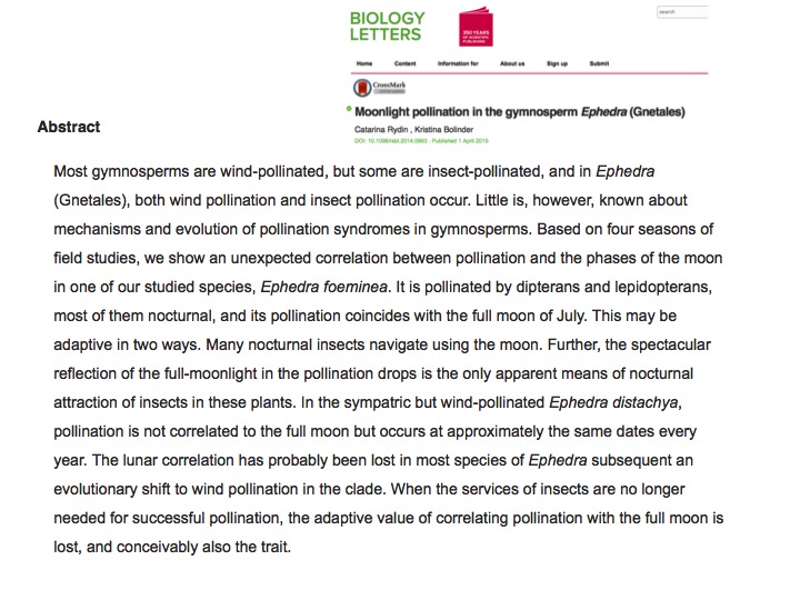
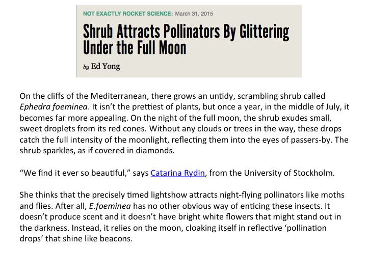
The original abstract and beginning of Ed Yong's story about this paper by Catarina Rydin and Kristina Bolinder.
We covered 3 potential components that you should think about incorporating into your science story pitch: Anecdotes, Analogies, and Imagery.
Anecdotes- A short story related to the topic that is amusing and/or interesting. Did you find yourself in a cave surrounded by angry bats? Or have to
Analogies/ Similes/ Metaphors- Generally, these are comparisons between two (or more) things for the purpose of explanation, clarification or illustration. In science, this is really useful for giving people an idea of the scale of your work, especially if what you study is really big or small.
- States and football fields are good for explaining the size of large areas- I often explain the scale of my most recent experiment by telling people that we hand-harvested (with standard office scissors) the equivalent of 2 football fields of alfalfa.
- For small things, think about the width of a human hair, or the thickness of a coin- you might be able to compare the size of your study species or an area to commonly known, small objects.
- Common objects are good for comparing weights- the cow example below, does your study species weigh as little as a penny? Check out this great interactive feature from National Geographic comparing blue whales to common objects (tanks, planes, people, school buses, T-Rex?)
- Also, it's good practice to know how to compare your scientific measurements (metric!) to other common measurement systems, especially if you're talking to American audiences. For example, 1 hectare is just over 2.5 acres, which is about 0.3% of a square mile. A centimeter is a little over 1/3 of an inch (0.39cm/inch). A meter is 3.3 feet long. A kilometer is almost 2/3 of a mile (0.62 km/mile). One liter is a little more than 4 US cups (4.2 cups/litre). Look this stuff up if metric measurements are an important part of your research.
For other senses, see discussion below about imagery. You'll be using analogies/similes/metaphors for describing how things look/ feel/ smell and taste.
Imagery- (Both real and verbal)- People reading/ looking at/ listening to your story should be able to see or envision what your work/ study species/ environment looks like, not to mention what it smells like, feels like and tastes like. Describing the ways that your science engages with the senses helps people form a real connection. Get your adjectives out people.
Some resources on how to choose actual visuals:
Pictures of numbers- A site by a colleague of mine from NZ which isn't really updated much anymore, but has some great examples of how to visualize data.
I like this blog post from the American Geophysical Union on 'Crafting your own visuals for science communication'
Our second activity gave everyone a chance to brainstorm potential anecdotes, analogies and imagery for their science story pitches.
Kat Kerlin told us about how scientists who can use these components really make her job easier. For example, she talked about one of her first conversations with UC Davis postdoc Sarah Moffitt. Sarah was describing her methods to Kat and said “After the initial sampling at sea, I took the entire core, which was about 30 feet long,” Moffitt said. “I cut it up like a cake, and I sampled the whole thing. Because of that, I had the whole record.” That description (both an anecdote and an analogy!), really helped Kat with shaping the story and it was a subheading in the press release sent out by the University. Sarah also wrote a great piece for Medium on her advice for scientists seeking to engage with the media. Read it here.
In another example, Kat talked to Carson Jeffres about his work experimentally raising juvenile salmon in California rice fields. When asked about what it took to make the rice fields into ideal fish habitat, Carson said “Just add water. All of those habitats are very productive for fish.” that 'just add water' statement became a key component of the UC Davis press release about the research.
Ben Landis Young gave us a great resource for a site that will make suggestions for comparing the sizes of things (Wolfram Alpha). We plugged in a number- 1.6 tonnes and found out it's roughly equivalent to the weight of 2 dairy cows. The results on this website can be a little random, but also helpful and entertaining! Ben has also written a great blog post about general science communications and the importance of a good headline- check out the links within for more examples of good scicomm!
For more examples of how much good story telling can transform how people read about science, I pulled up a few stories written by Ed Yong, who writes the hugely popular Not Exactly Rocket Science blog for National Geographic. He science writing is engaging and super entertaining. It's full of great examples of how to utilize analogies, anectdotes and imagery into stories about science. I read two of Ed's recent stories and then read the abstracts of the papers he'd written them about (see below).
The original abstract and beginning of Ed Yong's story about this paper by Catarina Rydin and Kristina Bolinder.
|
|
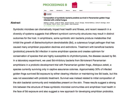
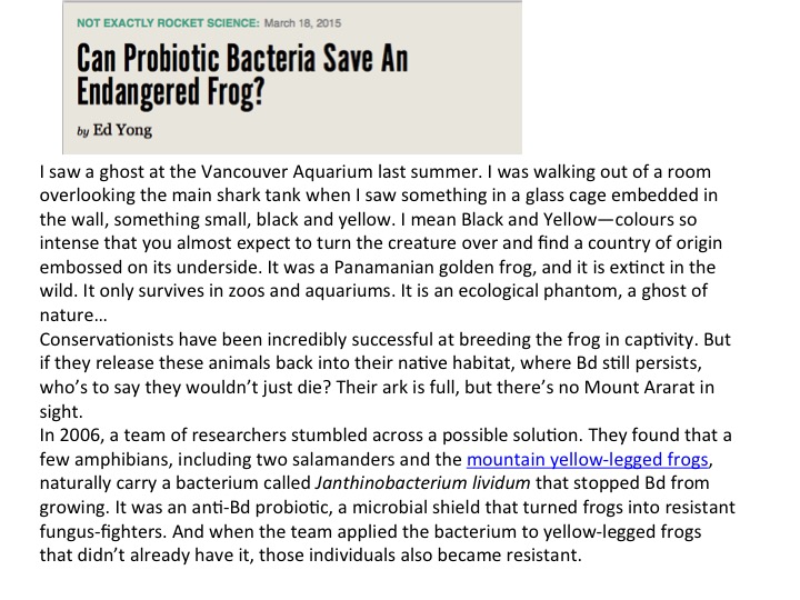
The original abstract and the beginning of Ed Yong's story about this paper by Matthew Becker and colleagues:
|
|
